The parts I used to create this image can all be found in the following source image:Cursed Gold
Also check out the full resolution to see more details.
I will explain how I made things and what decisions I made before and during making the image. I use the step by step images to illustrate my story and also add some extra images where needed.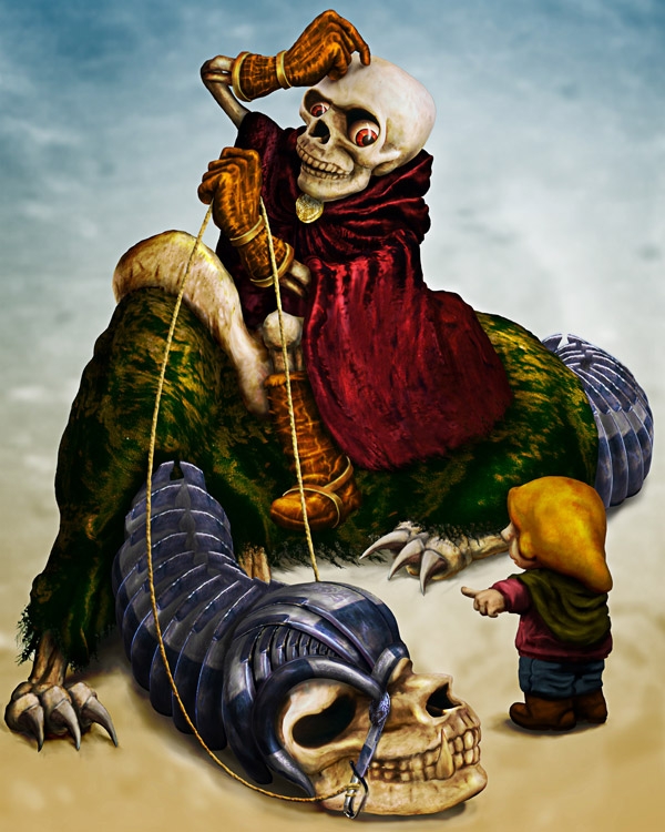
Step 1
Before even opening Photoshop I did some brainstorming. The skull was the most interesting part for me, I wanted to do something with that. The link with "death" was pretty easily made and not much later it became "Death". I didn't want it to be too serious though, so I thought of something stupid that could have happened to Death.Of course, "Death" is one of the four Apocalyptic horsemen and his other comrades wanted to fool him (...again. Yeahh, they're really some funny mates :-)). So they told him a certain short cut direction, but it's obvious he'd get lost then.
In the end I skipped the Apocalypse idea, but I did like it that "Death" was a horseman, so he could ride on some animal. This way I could do more with the skull. And then I also liked the little twist that he had to ask some little kid where to go, because that makes the whole image more innocent despite the subject.
Enough material to get started!
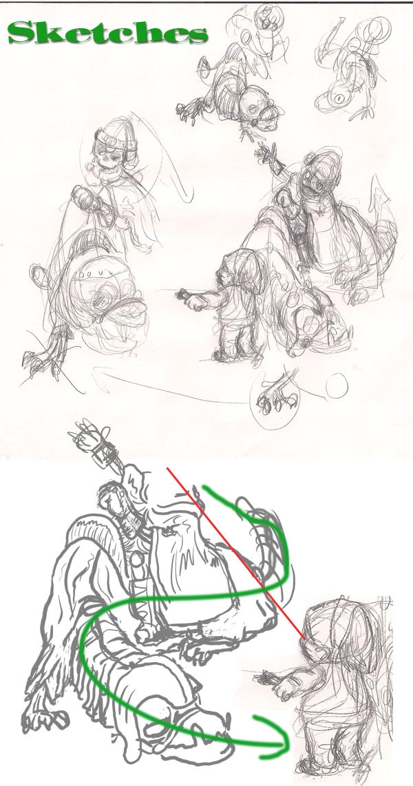
First a sketch. I took a look at the source image to see what elements I could use and how it could be placed and combined for what I had in mind. There's the skull for "Death" and the animal, and a lot offabric for the cape of "Death". Then a sword, that could be handy to make some armor for the animal, to give it a bit more dangerous and impressive look.
That in combination with some own drawing should be enough to fill the image :-)
I didn't want the skull to be used 2 times the same direction, to avoid obvious repetition, so I had to find a way to fix that.
After some trying I came with some composition that I liked: "Death" on the left side, head in the upper corner, looking down to the kid on the rightdown corner. Because of the camera view, Death looks quite impressive, especially compared to the kid. You are looking up to him, like he is supposing to have some status. Of course, in this situation he looks far from an impressive character. With this contradiction I try to make the situation more weird. The animal was is some kinda Z-shape in a more opposite diagonal compared to the "Death"-kid diagonal, but because of this Z-pose I tried to let the viewer look from "Death" to the kid.
The base is there!
Step 2
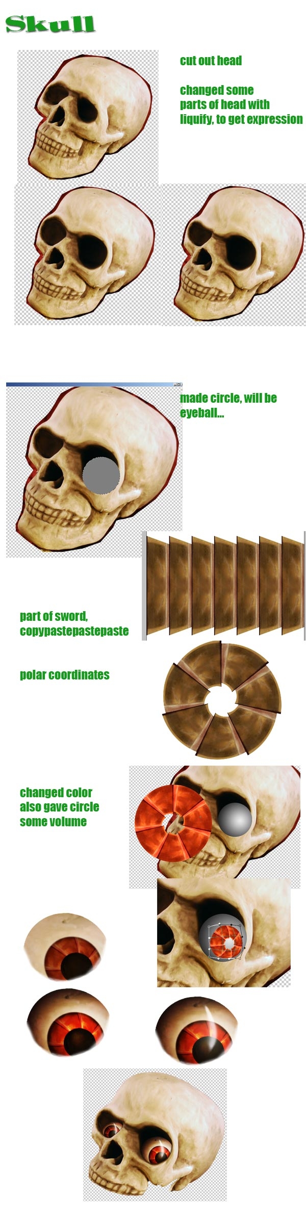
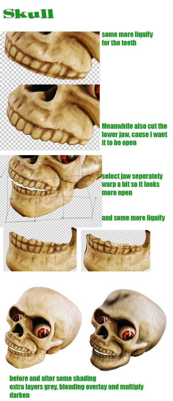
I started to cut out the skull. Mostly when I select/cut out an image I make a more or less rougher selection just around the part I needed. As you can see in the image, I cut out the skull with some extra background. I do that because I have the feeling I can play a bit more with the final selection if needed. For the final selection I mostly used the magic wand tool (if there's enough contrast) and after turning the selection into a mask I fine tune it with a soft brush (9 pt). I prefer to give the edges a bit of soft touch (depending how much it would fit within the image), because in my opinion that looks more natural. Now I have to admit that for this entry I kinda forgot to fine tune the top of the skull...An important part for this image is to show how "Death" feels. The viewer has to see his expressions and the eyes are one of the most important to show what's all in his mind. That's why I started changing the eye holes in the skull. From "neutral" I tried to make them more "desperate and wondering". I did that with Liquify. Quite a big brush, so that I was able to move a whole part of the skull without risking to distort the skull too much. Just little by little moving until I got what I wanted. The eye holes were one part of his expression, the eyeballs had to do the rest.
So I made the eyes too. Big to make him look more wondering where on earth he was while he tried to understand the kid's explanations. The eyes were quite simple. Just a circle with some radial gradient. As pupil a part of the sword that I turned into a circle with polar coordinates and gave some blurred edges to make it look more natural. I put the pupil on the ball, some warping to make it look more round. More about the eye in the next step.
Step 3
For shading I make a grey (#7f7f7f, that's 50% black) circle as base for the eye. Above that circle I make another bigger circle with a radial gradient (black to white). I use clipping mask to make the big circle part of the eye base. I copy the gradient circle 2 times and use different blending modes to create the right 3D effect I want. Then, to make the eye less clean I blended some skull texture on top of the ball and added some extra shading and highlights.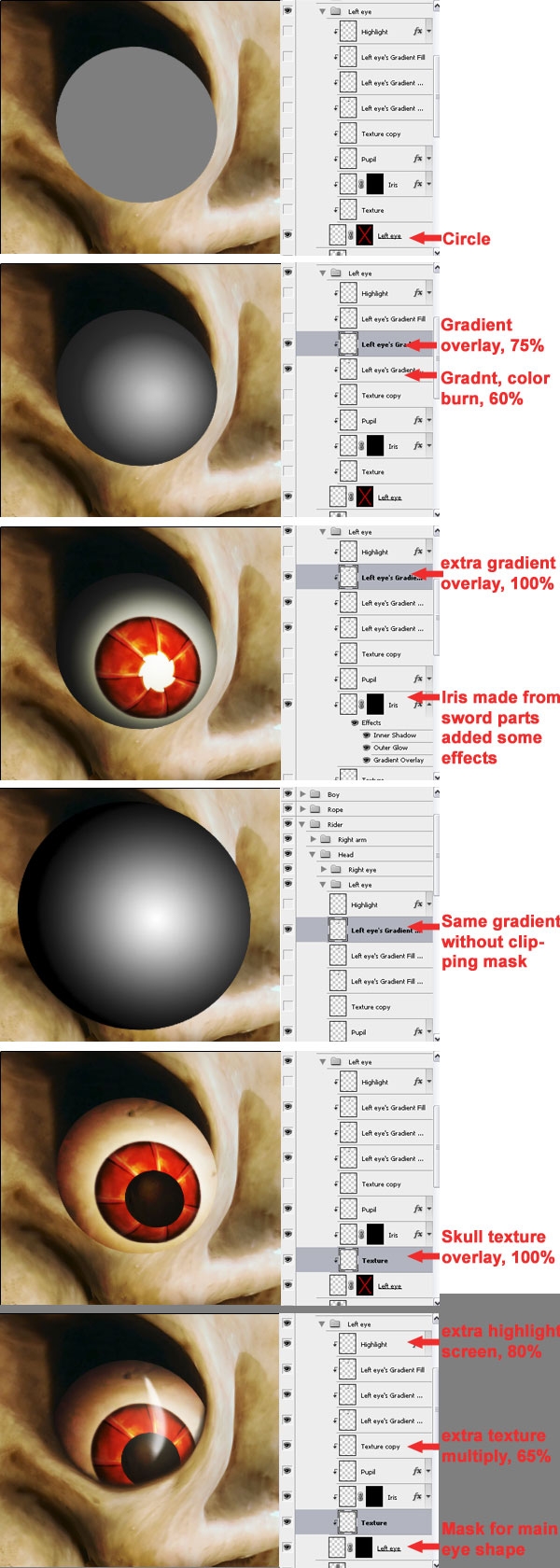
Step 4
The eyes are one important way to make an expression, the mouth is another one. Right now the mouth was too neutral and too "dead" for my taste. At least it didn't communicate for what I wanted for "Death".The best way to find out how your character should behave is to actually DO what you want the character to be like. I noticed that if you're wondering or are almost desperate, I open my mouth a bit, even make it a bit in a stupid drooling kinda way. So that's what I did with the skull!I duplicated the lower jaw and masked away from the both layers that I didn't need. I also made the teeth from the upper jaw a bit bigger and changed somewhat of the position so that they looked more real and lively. I warped the lower jaw a bit so it became more a open drooling mouth. Because the mouth was open, you can actually look in the mouth and are also able to see the topsides of the teeth. I liquified the teeth from the upper jaw to make these sides.
Finally, to make the skull a bit more dramatic I added some shades and highlights. Just as for the eyes, I used a grey layer in overlay mode and burnt the parts that I wanted to be darker, dodged where I wanted it to be lighter.
Step 5
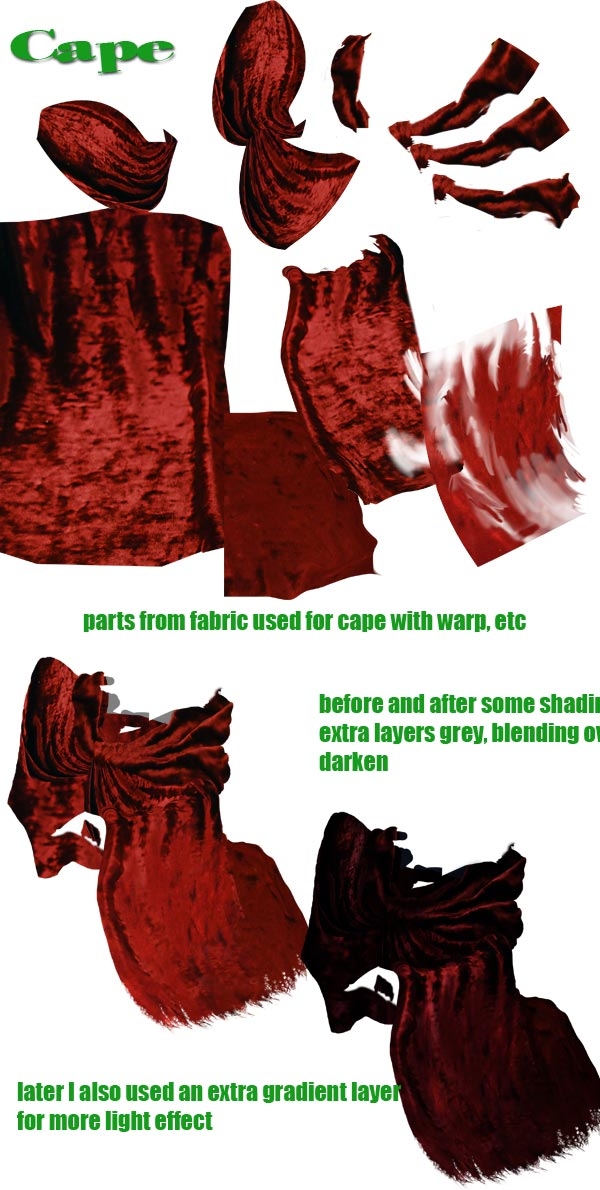
Making "Death"'s cape wasn't that easy. The problem was that despite there was a lot of fabric, there wasn't that much of it that was actually on focus. I prefer not to use sharp and unsharp parts next to each other if it's not logic. In this case: it would be weird if the skull was all sharp, but the cape was all blurred. So I had to be a bit careful with what parts of the fabric I had to select, otherwise it wouldn't look natural.Then I had to make folds in the cape to show that there was an arm under it. I used the original folds from the source and Liquify was a help to make it look like that the cloth was wrapped around the arm, although unfortunately in the high resolution you do see I used too much liquify for the left arm's folds, because the origial texture is a bit lost.
Anyway, I could hide some of the blurry parts because I combined them with sharper parts (bit of puzzling with the mask). With extra shading I tried to make enough contrast so that the folds were visible enough (and also to hide here and there the out of focus fabric).
In general: if you don't want people to see the lower quality parts, better try to hide them in any way (for example with shading).
Step 6
The easiest way for me to make the hands was just by drawing them. I did use a texture from the fabric to make the gloves a bit lively, but to make the fingers visible enough the best was to draw. The technique is the same as what I did with the eye. A layer as base with the shape of the hand (that I drew before, so I had a clue how to make the shape). Then working with grey layers in blending modes to add shades and light where needed.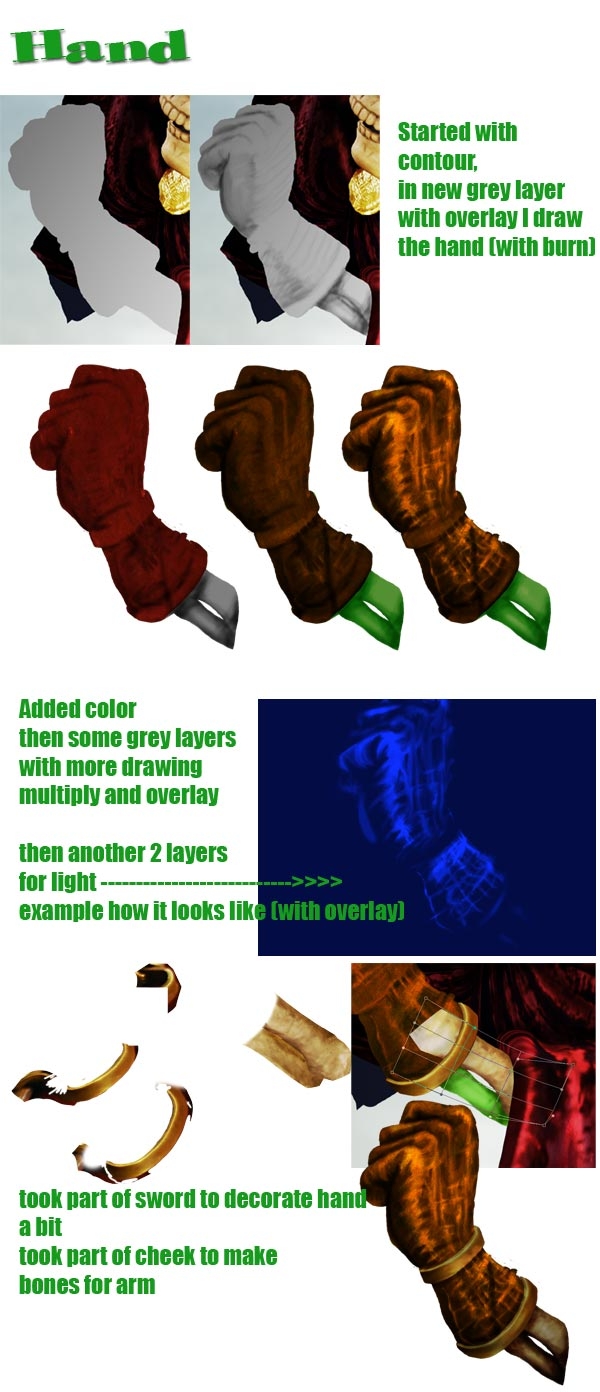
Step 7
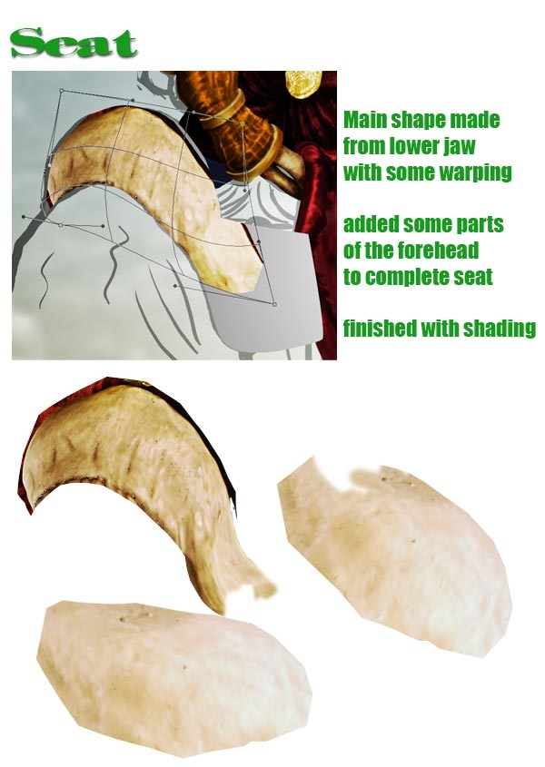
I had no clue how to make the seat at first. Then I found it: the lower jaw from the skull had a perfect shape to become the front of the seat.The good thing about the jaw is that the edges were already with some shading and thickness, so it looked more natural.
Think about this: the less you have to make yourself, the better ;-).
Of course much depends in what kind of style you work, but since I had some comical 3D style, this jaw fits perfectly with the rest. Just some distortions with the warp tool and it was done. Well...almost, because I needed some more parts for the other sides of the seat. Luckily no big problem. To finish the 3D look and to make the different parts a whole, I added some shades.
Step 8
To make the booth is a same story as how it was done for the hand (and eye). A matter of drawing and thinking how the light falls on the boot.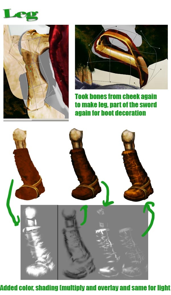
Step 9
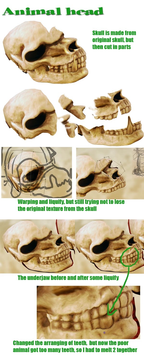
As said before, I didn't want to make a too obvious repetition from the same skull for both "Death" and the animal. One way to avoid that is that I flipped the skull horizontally for the animal. But the skull was also too human-like, it needed to look more like a beast. So copied the skull a couple of times, selected the parts I thought that were useful, warped & liquified here and there to make them all fit together, and voila!A main difference with the human skull is that I made the animal more from profile. This also had some consequences for the teeth. Although I'm not all sure for animals but in general you can say that you have 32 teeth in total, so 8 on the left or right side of an upper or lower jaw. Because the original skull was seen from 3/4, you could see more teeth (which is logic), but from aside you should see only these 8 teeth.
Since I used the whole shape of the jaws and also made the front teeth a bit bigger with liquify, I couldn't just remove some teeth by masking the outside, so I decided to combine 2 teeth together.
I'm not sure if above story made any sense, but for me it was the right decision to make the angle from the animal skull more realistic looking :-). Perhaps details that wouldn't make sense, but when I didn't do it, I think there would be something unlogic about the skull. Don't get me wrong, of course this whole image is unlogic in the sense that it's just fantasy, but inside this imaginary world I like to make rules too. What is allowed or what can happen and what not. Take your time to think about these kind of things, it will make working on an image only more fun.
Also for the animal the following: don't just make him, but BE him. How he reacts on this stupid situation? Likely for him it's not the first time and he knows better. With his expression (eye, mouth but also body language) I tried to make him like he's secretly giggling a bit, also by actually acting myself how he'd do that.
And then just hope that the viewer will recognize the same ;-)
Step 10
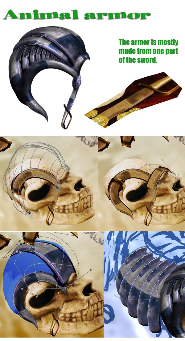
"Death" still should be some impressive character and so does for his animal too. I thought some cool armor suit would fit this beast to make him a bit more frightening. The parts for the sword fit my goal perfectly!I cut them out and warped the pieces around the skull. It took a little while, but then I found a way to make it more or less logic. For the neck I used these pieces too. To stress that there's a certain depth/perspective in the neck (it comes towards the viewer). I repeated the iron parts several times and placed them that way, that the neck had some curve.
It's all just a matter of placing each piece on the right distance compared to the other pieces. And here and there some warping, bit of rotating and scaling. Shades and light effects were the finishing touch to emphasize the 3D of the neck. I made the iron parts blue for the reason that I simply liked it, but also to bring back more blue in the whole image. Most of the blue would be on top (air), for the composition I thought it would be nice to see some of the blue back more lower in the page. This, so the image would be more a whole.
Step 11
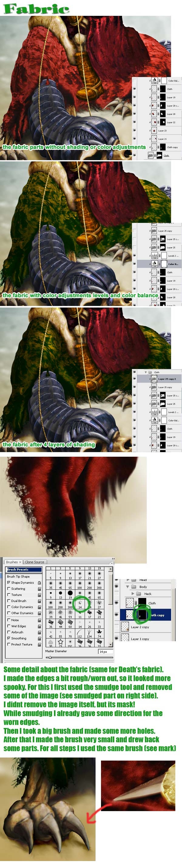
Not only the skull, but I also wanted the fabric for the animal different from "Death"'s cape.How? No clue! But the most likely of course would be a different color. "Death"'s cape was red (the original color from the source image). To let the red stand out more, I thought a nice combination would be green.
But first comes first. Meaning, I had to make the cloth for the animal by taking parts of the source's fabric. I had to keep in mind that the cloth had to be hanging around the animal, that the highest point was the animal's spine and that it was possible that some paw would come out from under the fabric. So in fact the same problems as with "Death"'s cape. With putting the parts on the right place and liquifying & warping here and there I created some shape and volume for the animal. See for example the area around the spine. I made it more round like so it looks more like the fabric is going around the body. Same for the backside of the animal (near the tail), I tried to make it look more flat because it's supposed to be round there.
Then the coloring. I wanted some green, but how exactly it would look like, no clue! So that was really just experimenting with the color balance. It turned out that I could create some yellowish parts in between the green. I was very happy with that, because this way it started to live more and the colors became more rich this way.
Remember, no matter how you create it, be aware of the fact that you decide what you want to do or if you want to go for it. Do the actions that you do add anything to the image or do they make it worse? Things like that. In this case I thought it was a good addition, also because the cloth looked more worn out and had some decoration all at the same time.
Btw, there will come a time that you don't have to be "aware" anymore as I wrote above. Then it'll be just all natural what you do and you'll be able to create beyond that what you had in mind. But until that time: be aware of your decisions! ;-) Ow, for the record: I'm still in the "awareness" zone...
I already wrote that I liked it that the fabric looked a bit worn out. It fits great with the characters, after all they're some old chaps! Also, that way they look some more scary. To do more with the worn out idea, I decided to torn the edges of the fabric. See the image how I did that.
The claws of the animal were created with skull parts, the nails were made of the point of the sword.
Step 12
The kid is just drawn. Same technique as described in some of the other steps, so not that much more to add to it.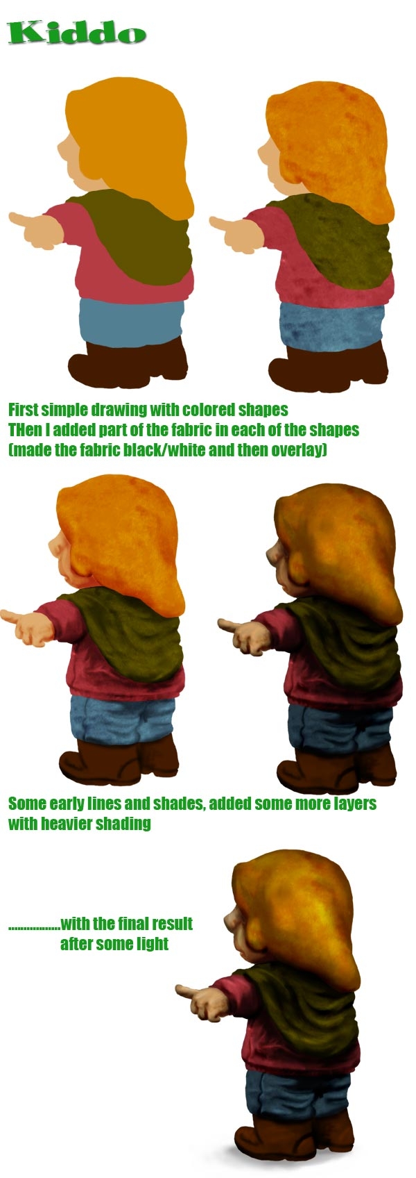
Step 13
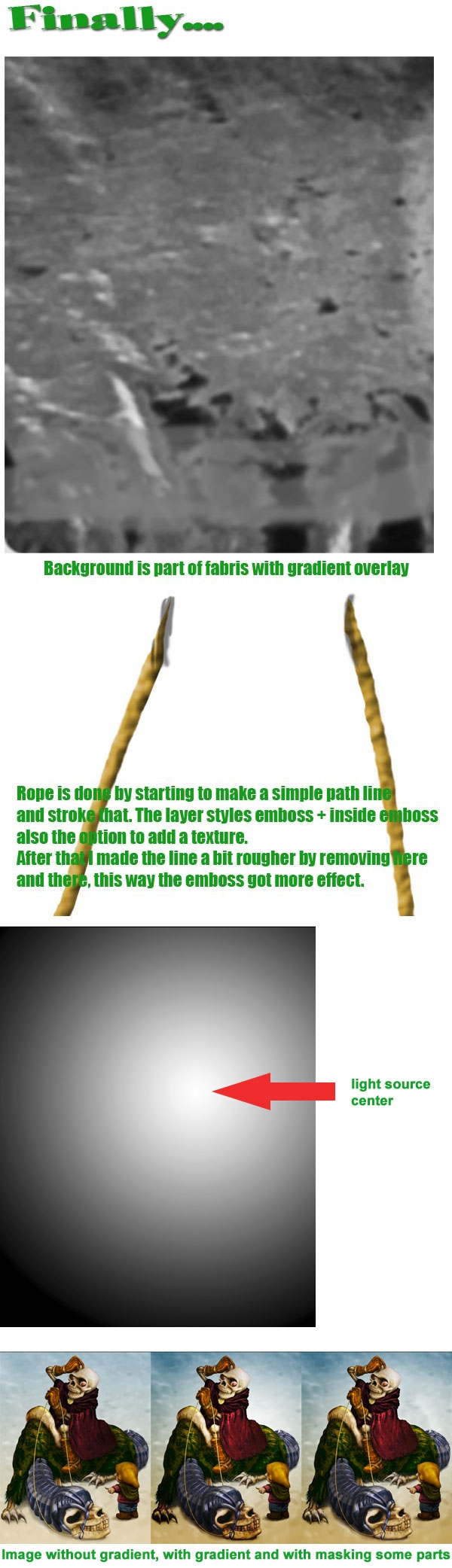
One of the things I really need to work on is backgrounds. Or I have no time left to make more interesting, but I'm just too lazy. For some reason I don't want to spend to much time on it.What I mostly do then is take a part of the source's background, scale it and use some color overlays. Sometimes the result is not even that bad then :-).
Maybe one other thing I want to add is the following:
Before I start with chopping and all that I determine where the main light source could be. As soon as I know that I add a gradient layer, make a radial gradient with black on the outside to white on the inside and then drag the whitest point to where I think the main light should be like. Then I change the blending into overlay. This way the things that should be lighter w�ll be lighter and things that are supposed to be darker will be darker. It's at least a good help for me to see what should be light or dark and it increases the drama inside an image.
Maybe not all parts should be that light or dark, but that's something you can mask away while you're creating.
Step 14
Ok, that was about it. Thanks for reading! :-)

0 comments:
Post a Comment